

Your cart is currently empty!
Quick start
First of all, feel free to edit all aspect of the theme, you always have chance to restore the theme to original appearance.
How to reset my modification? ⇣
1. When you enter Appearance Editor, you should be on Front Page Editor.
Upload your site logo if you haven’t done it before. Select or Create menu(Navigation).
About Display – OVERLAY MENU options, we designed 3 modes:
Off, Menu do not show on Mobile Phone, only show on PC or tablet. In this circumstance, you can setup some entrances on front page. You can also setup the Sticky Bottom Menu, please look the following tips.
Mobile, show as overlay menu on Mobile Phone, show as normal menu on PC or Tablet.
Always, always show as overlay menu on Mobile Phone, PC or tablet.
Tips On mobile or tablet, we designed Sticky Bottom Menu. This navigation bar is always displayed to improve user’s experience. If you want to modify this menu bar, please edit it in the Templates Parts – Footer.
2. Top-Right My Account icon.
You can set the link for this icon. Please set the link of Image but not the link of Image Caption. You can set /wp-admin/, or /my-account/ if WooCommerce plugin installed.
3. Page hero.
In order to improve mobile experience, we designed the mobile special styles, to keep the hero as landscape image on mobile. The paragraph in the hero area is hided on mobile. If you do not like this style, you can go to Advanced setting, remove the style name wpmobile_hero_resize. Moreover, all style name with wpmobile_ prefix is our theme special styles, you can keep or remove by yourself.
4. The blocks in the middle region of front page.
You can modify, delete or add contents. Our design idea is to place as many blocks as possible in advance and delete them when they are not needed, rather than requiring users to find blocks, add them, and configure them. This is more convenient.
5. Footer.
We prepared items that a e-commerce web site may need. You can modify the text and link. If you do not need, simply delete them.
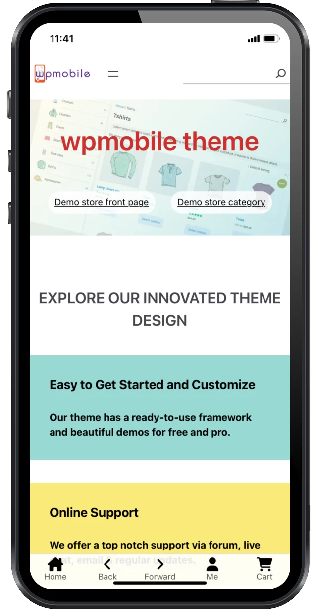
On the bottom of every template, we added 5 icons. It is Sticky Bottom Menu and only show on mobile. Modify the image link(and image caption link if you have it) to link your page or SLUG. But do not touch the links of left arrow and right arrow icons. Because we added JavaScript code to the links, let them respond Back and Forward operation.
If you want to customize your Sticky Bottom Menu, remove the old icons and add your icons. Set the height of icons to 22px.
6. You may need to set a Front Page for your web site.
Go Setting – Reading and select you Front Page.
7. We designed different styles for Mobile Phone, PC and Tablet.
When you edit site, click the top-right View icon to see the difference.
8. We designed some button patterns.
These buttons only show on Mobile Phone, do not show on PC and Tablet. You can distinguish them by the name affix (ONLY show on mobile). You may use these patters to create special mobile pages, and link mobile pages to Sticky Bottom Menu.
9. For a full list of theme features, please check Free v.s. Pro ➚
Issue
- Q. After installed wpmobile theme, the front page turn into blank page.
A. This might be WordPress issue. Because your Front Page has classic block. Please modify your Front Page, clear all classic block, or create new Front Page. You can go Dashboard by this link: http[s]://yourdomain/wp-admin/ - Q. Appearance Editor messages. ‘Review x change(s) and save’ on left-bottom,’Attempt Block Recovery’ in blocks.
A. Because our theme is compatible to the version from WordPress 6.1 and WooCommerce 7.3. The higher version of WordPress and WooCommerce may make few changes to our theme. You can accept the modification or upgrade and save. - Q. Product by Category, Product by Tag and Product by Attribute 3 templates, inform Modify or ‘Transform Into Blocks’
A. Because these 3 templates are developed on WooCommerce V7.3, WooCommerce later version will inform to upgrade template. You can click accept and save. - Q. In Appearance editor, the template, template parts and pattern looked a little different to real page. For example the element alignment and size are different.
A. This is the Appearance editor issue. Please refer to the actual page effect. - Q. Sticky bottom menu. After modify the footer, the editor informs “Attempt Block Recovery.”
A. Because our theme is developed on WordPress 6.1, WordPress 6.3 updated the code standard. It is safe to accept the recovery, and then you need to set the image height to 22px. - Q. How to reset my modification?
A. Go to Appearance – Editor, look for templates list and template parts list
For WordPress 6.1, click top left W toggle navigation – Templates.
For WordPress 6.2 and 6.3, Templates – Manage all templates,
For WordPress 6.4, click left button of Front Page to return upper level – Manage all templates,
If there is a 3-dots button on the right side of list, click Clear Customization to restore the template.
A little more…
WordPress block theme is very different to classic theme. Normally the classic theme creates the web site UI via the customize function of the theme. Block theme is similar to page builder, use the similar method to create web site UI. Theme can utilize template, template parts, blocks and patterns to combine the UI. The final web site page is generated by template frame + published content(i.e. a post). Template is combined and customized with template parts, block and patterns.
About Appearance Editor. On top-left, find Templates. Select a template and enter the editing status. click  icon to open the struct tree of the current template. This struct tree indicates how the current template is arranged, nested and combined by parts, blocks and patterns. Every leaf of the tree can be add, delete, drag and drop. Select a leaf(element) of the tree, there are pop up menu bar and Settings panel on the right. To change the appearance of element, please note all the options on the pop up menu bar and Settings panel. For more adjustment, go to Advanced option and add CSS name.
When customize the theme, you should think about, what kind of web site do you need? The header and footer of web site is customized via the header and footer in template parts. When the header and footer parts added to every template, the web site has a unified look of header and footer. Moreover, we have a blank template. This template has nothing but the Sticky Bottom Menu. You can use it in post or page, add any block freely. Thus the post or page will have a unique UI.
About PWA – Progressive Web Apps ➚
If you installed PWA plugin which is created by PWA Plugin Contributors, you will have only 2 setting options. On Settings – Reading – Offline Browsing and Tools – Site Health. If you do not have Site Icon, PWA plugin will inform you. Please refer to PWA’s FAQ: https://github.com/GoogleChromeLabs/pwa-wp/wiki/FAQ
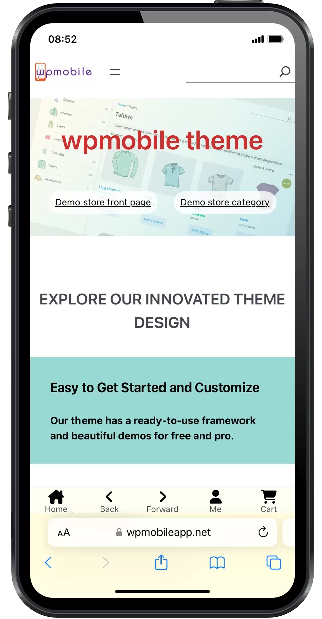
PWA plugin is designed very clean. It silently completes all possible automation work. PWA plugin set Minimal-UI as it’s default mode. wpmobile theme is suitable to Standalone mode, which has more native feel. If you installed PWA plugin, your web site will be Standalone mode ready. Please look the difference of the web page bottom.
More info: How to push my mobile website, let my mobile customer open my site without difficult?
- Put QR Code on pages. Let user Scan to open on mobile, or Buy on mobile.
We have QR Code tools in Pro theme. The QR Code will take the current page URL as it’s URL. You may set the image URL, then the QR Code will be that URL. You may also add caption, align the block to left, center or right. The QR Code will only show on PC screens, will hide on mobiles. - Install PWA plugin. On Android OS, the browser will inform user to Add to Home Screen on appropriate time.
- Embed your site to APP. There are tools automatically pack web site to APP.
Suggestions
- Draft in advance. Think about what kind of web site you need.
- Be familiar with templates, parts, blocks and patterns. Convert your draft to block tree. You may need some time to learn every block features and adjustment methods. Using our wpmobile themes can ease this work.
- The style of the template should be unified. Consider the font, color, alignment, margin of each block… Our wpmobile theme already has these unified designs.
- Make the website adapt to different screen sizes of PC, Mobile phone, Tablet. Make good use of Group Block and Stack on Mobile options of some blocks. wpmobile theme has already set these up in advance.
- If you know a little bit of coding, you can add the CSS style name in the Advanced option of Block. Add the style code in the style.css of the theme. This can add a unique effect to the website. The wpmobile theme has many unique styles pre-set.
Any questions, comments, issues, please feel free to contact us, via forum, contact form, email, live chat.